
Andy Warhol's 1965 Colored Campbell's Soup Cans: Reconstructing the Factory
Updated: Oct 23
In 1965, Andy Warhol returned to one of his most recognizable subjects, the Campbell's Soup Can, experimenting with unexpected combinations of color that gave the familiar commercial image an entirely different appearance.
The resulting series of twenty paintings includes everything from vivid contrasting colors to more restrained combinations of black, white, and muted tones.
While the compositions are closely related, the surfaces reveal differences in how the colors were applied, how the printed graphics interact, and how individual canvases were prepared.
These variations have become central to our research into Warhol's working methods at the Factory.
We've been studying the original paintings alongside historical Factory photographs, vintage paint materials, original Campbell's commercial artwork, and archival references. The work has also involved testing paints and preparing canvases to explore how the original surfaces and printed layers might have been produced.
Along the way, photographs that initially appeared to document ordinary workshop activities have provided some of our most useful clues.

Andy Warhol's 1965 Colored Campbell's Soup Cans: Exploring Color
Our research into Andy Warhol's 1965 Colored Campbell's Soup Cans has revealed differences in color placement, painted surfaces, and printing characteristics across the twenty paintings.
Some feature bright backgrounds and contrasting labels. Others use more subdued colors, allowing the graphic outlines and lettering to dominate.
Comparing the paintings closely has revealed differences that aren't always apparent in catalogue photographs.
Color boundaries vary, certain printed details behave differently from one canvas to another, and some surfaces suggest that multiple applications of paint contributed to the final appearance.
Rather than treating each painting as an isolated work, we've been comparing repeated details across the series to understand what they might tell us about the Factory's approach to producing these canvases.
The variations are especially interesting because they raise questions about which parts of the process were repeated and which were adjusted for individual paintings.

Looking Inside the Factory
Historical photographs have become an essential part of the research.
Images taken inside Warhol's Factory show paintings in different stages of production, along with materials, equipment, and assistants working on the canvases.
We've spent considerable time examining these photographs, including details that occupy only a small part of the original image.
The position of a canvas, the appearance of an unpainted edge, or the way a fabric surface bends can provide useful information about how the painting was prepared.
While examining photographs from 1965, one detail caught our attention: several canvases appeared to have arrived at the Factory with a prepared white surface.
This observation led us to revisit our assumptions about canvas preparation and investigate the commercially available materials Warhol might have used.

Investigating the Original Canvas Preparation
Preparing the painting surface has become one of the more interesting parts of the project.
Our initial research involved examining the appearance of surviving paintings and comparing historical descriptions of their materials.
Some are catalogued as canvas, while others have been described as linen. Determining the type of fabric is only part of the question. The preparation of that fabric can also influence how subsequent colors and printed graphics appear.
Photographs showing loose, prepared canvas at the Factory have been particularly useful.
In one image, the fabric bends around its edge while retaining a clean, white prepared surface. This raised questions about the type of coating used and whether it had been applied before the material arrived at the Factory.
We began examining commercially primed canvas and linen, comparing their surfaces with the historical photographs.
The research has also included experiments with modern acrylic and alkyd-based coatings.
These tests have produced noticeably different results. Some materials retain considerable flexibility, while others create a much stiffer painting surface.
The experiments don't establish the exact preparation used by Warhol, but they have helped us evaluate different possibilities and identify characteristics worth investigating further.

Searching for the Original Colors
Color has presented a different set of challenges.
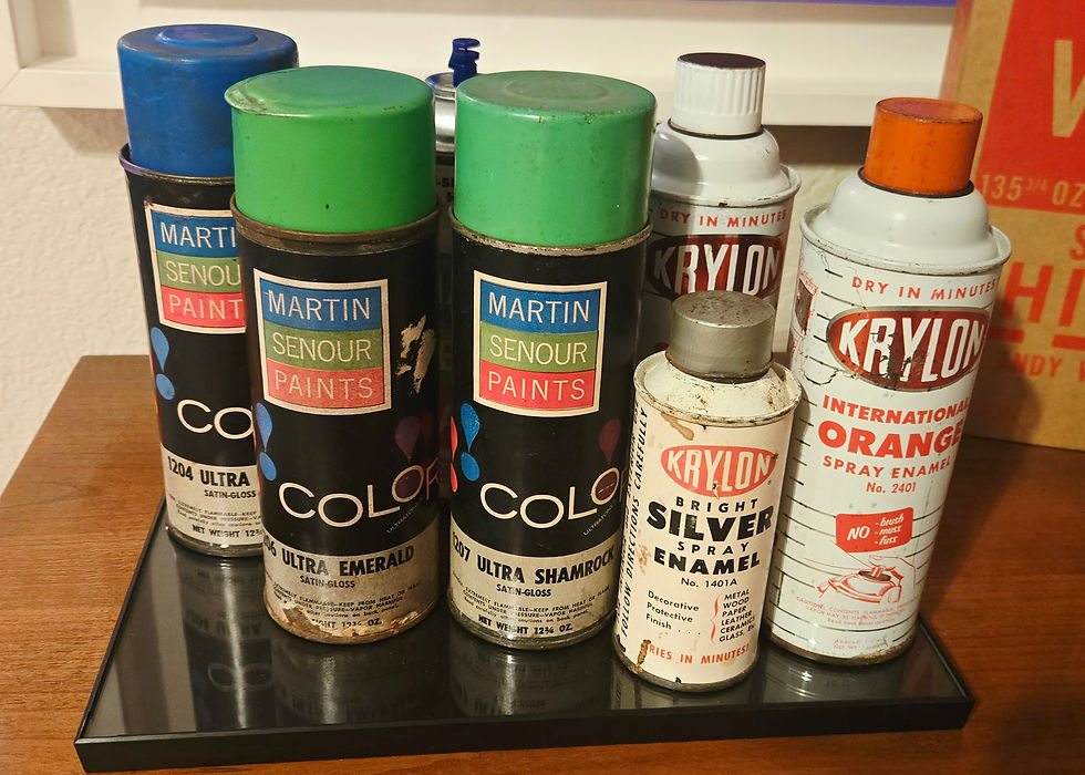
The paintings were produced at a time when aerosol paints and commercially manufactured colors were becoming increasingly accessible, and photographs from the Factory provide evidence of these materials in Warhol's working environment.
Identifying the products available during the early 1960s has taken us through vintage paint advertisements, manufacturer catalogues, surviving aerosol cans, and original color charts.
Some of the most useful references have been decades-old color cards, which provide a physical record of colors that may no longer exist in their original formulations.
Finding these materials hasn't always been straightforward.
Certain manufacturers have disappeared, product lines have changed, and complete historical color collections can be difficult to locate.
We've been comparing these references with photographs of the surviving paintings and experimenting with contemporary paints to see how closely their colors and surface characteristics correspond.
A color that appears convincing on a computer screen can look quite different when compared with a physical historical reference.
This has led to adjustments, rejected samples, and an ongoing search for more reliable evidence.

Reconstructing the Campbell's Artwork
Reconstructing the original Campbell's Soup Can graphics has involved searching for commercial artwork produced by the Campbell Soup Company during the early 1960s.
One particularly interesting discovery came from a Campbell's Soup Company envelope featuring printed illustrations of its soup cans.
While comparing the envelope artwork with Warhol's 1965 Colored Campbell's Soup Cans, we began examining how closely the lettering, medallion, decorative elements, and overall proportions corresponded.
Digital overlays revealed a close alignment between the commercial illustration and the imagery used in the paintings.
This has made the envelope an important reference in our effort to understand the original artwork and how it may have been adapted for silkscreen printing at the Factory.
The comparison also raises questions about which details originated in Campbell's commercial artwork and which resulted from Warhol's printing process. These are being examined as we continue reconstructing the graphics.

Exploring the Painting and Printing Process
The combination of painted colors and silkscreened imagery is one of the defining characteristics of the series.
Understanding how these elements were brought together requires examining both the finished paintings and the evidence of their production.
We've been studying color boundaries, changes in ink coverage, repeated printing characteristics, and the relationship between painted areas and the graphic outlines.
Comparing the original paintings has revealed differences in color placement, ink coverage, and printed details that may provide clues about the order in which the colors and graphics were applied.
These observations are helping us develop working theories about the Factory's painting and printing methods. Our current experiments have focused on canvas preparation, historical paint materials, and surface characteristics.
Testing the proposed color-layering and silkscreen printing sequences will be a later stage of the reconstruction.

Bringing the Research Together
The research has taken us from examining original paintings and Factory photographs to collecting vintage paint references, studying historical Campbell's artwork, and experimenting with canvas preparation and painting materials.
Along the way, some discoveries have supported our early ideas, while others have led us to reconsider how Warhol and his assistants may have approached the paintings.
These findings are helping establish the materials and methods we'll investigate in the next stage of reconstructing the 1965 Colored Campbell's Soup Cans.
Our longer-term goal is an educational exhibition bringing together historical photographs, original reference materials, experimental samples, and contemporary reconstructions, allowing visitors to follow the research and its development.
There's still more to explore, and we'll continue sharing our discoveries, observations, and experiments through the RECONSTRUCTING THE FACTORY Research Journal.
Explore the Research


Comments